Project Overview
The Company / Product
Agree On IOS helps friends and family stay on track to repay one another for shared expenses.
The Problem
Agree On had version 1.0 available in the app store, and was looking for ways to improve the experience.
Project Goal
Conduct research with our target audience to define high impact changes, and relaunch version 2.0 of the app in 6 months.
Team Size (2)
1 Designer (Me), 1 Founder / Engineer
Duration
6 months.
My Role
- Conduct UI/UX Analysis.
- Plan and co-facilitate focus group.
- Lead Design for version 2.0
Results
- Launched version 2.0 with increased downloads and positive reviews in the App Store.
Project Highlights (What I Did)
01. I conducted UI/UX Audit
02. I helped to plan and co-facilitate a focus group.
03. I lead Design for version 2.0
01. I conducted UI/UX Audit
Approach
Articulating product goals and project scope
Before designing any screens, we discussed the problem the app intended to solve for users and roadblocks the founder was facing in getting an MVP to market. We distilled this information in to a document that gave the product direction and put the project in to perspective. It included purpose, goal, aspirations, aesthetic direction, all of which had not previously been articulated.
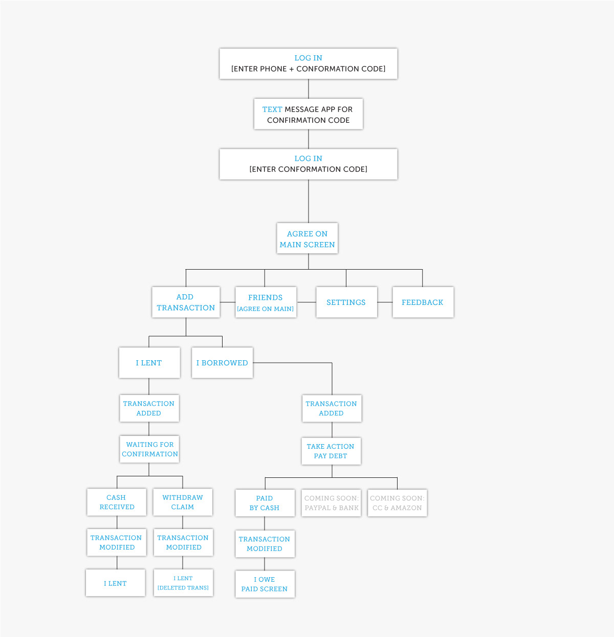
Creating a user flow diagram to facilitate client discussion
I created a user flow diagram that allowed us to view the experience in its' entirety. It also provided questions for us to ask users in upcoming testing sessions. Rather than make changes at this time based on our own assumptions, we determined we'd leave that to users based on feedback during testing sessions.
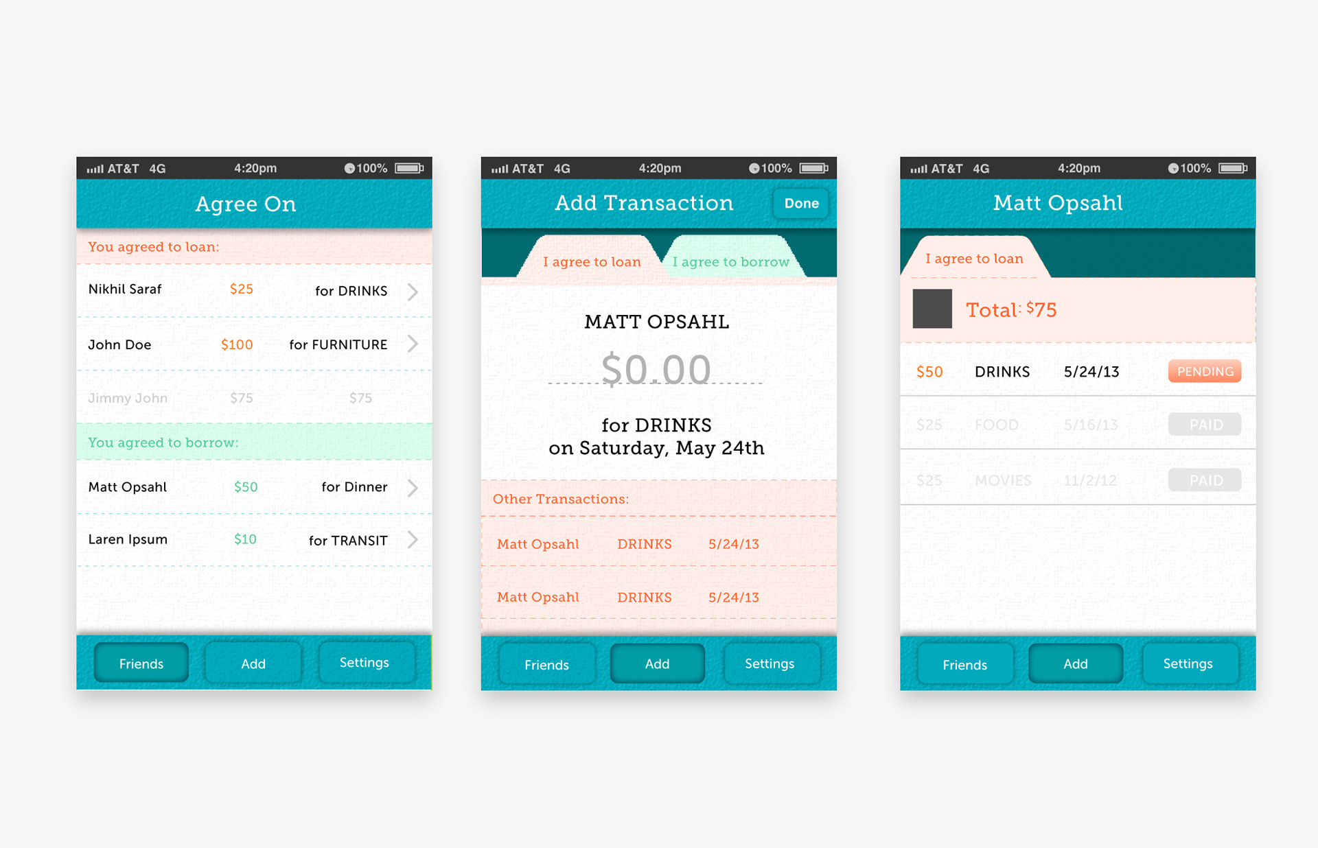
Visual design options
I proposed two design options to get feedback on from users based on the attributes we ascribed to the product. These would be presented as static comps, not as a prototype. The challenge was striking a balance between “friendly” to “business”.
Option 1 utilized a bright palette and modern components that felt friendly yet professional
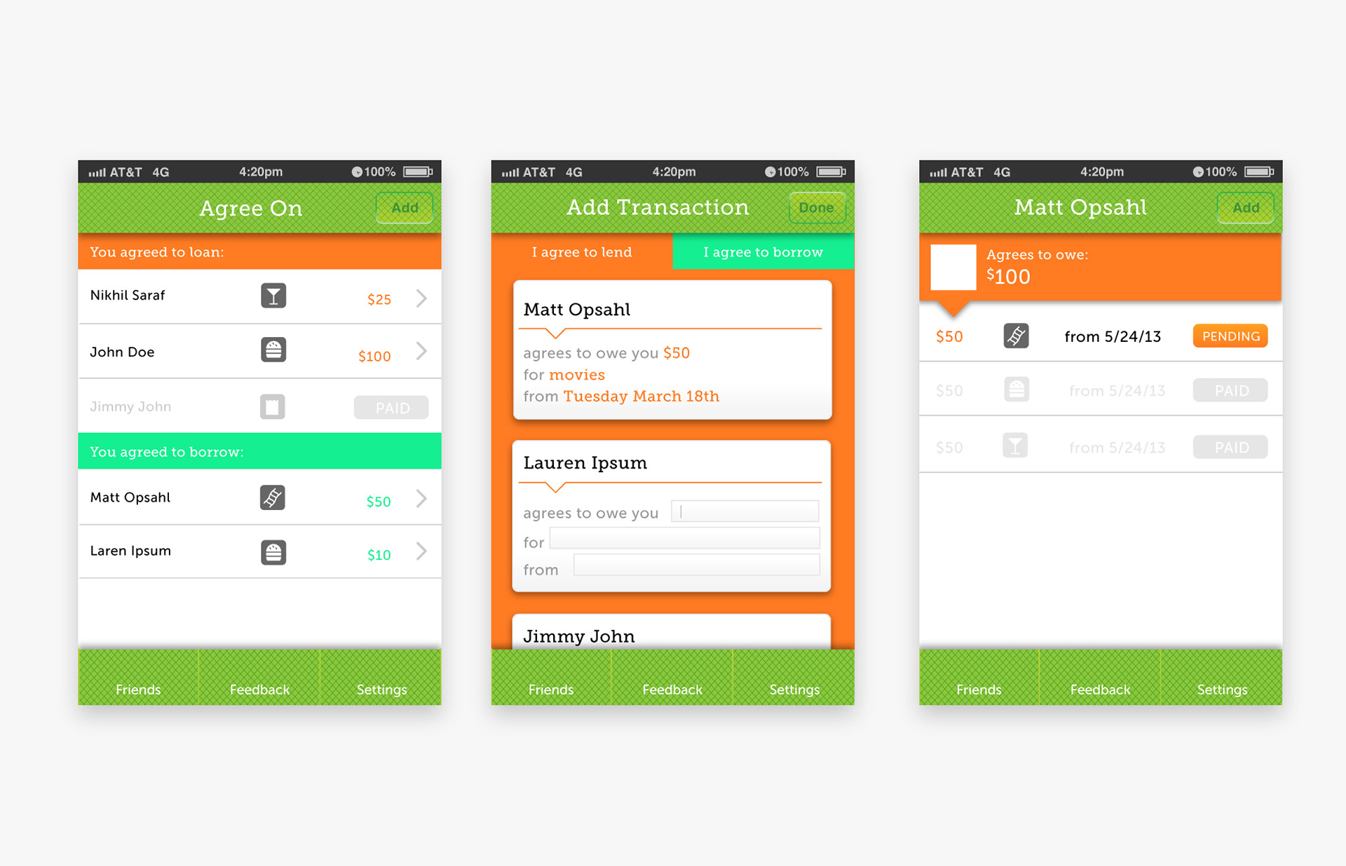
Option 2 relied on a blue palette and more traditional elements to feel more trustworthy.
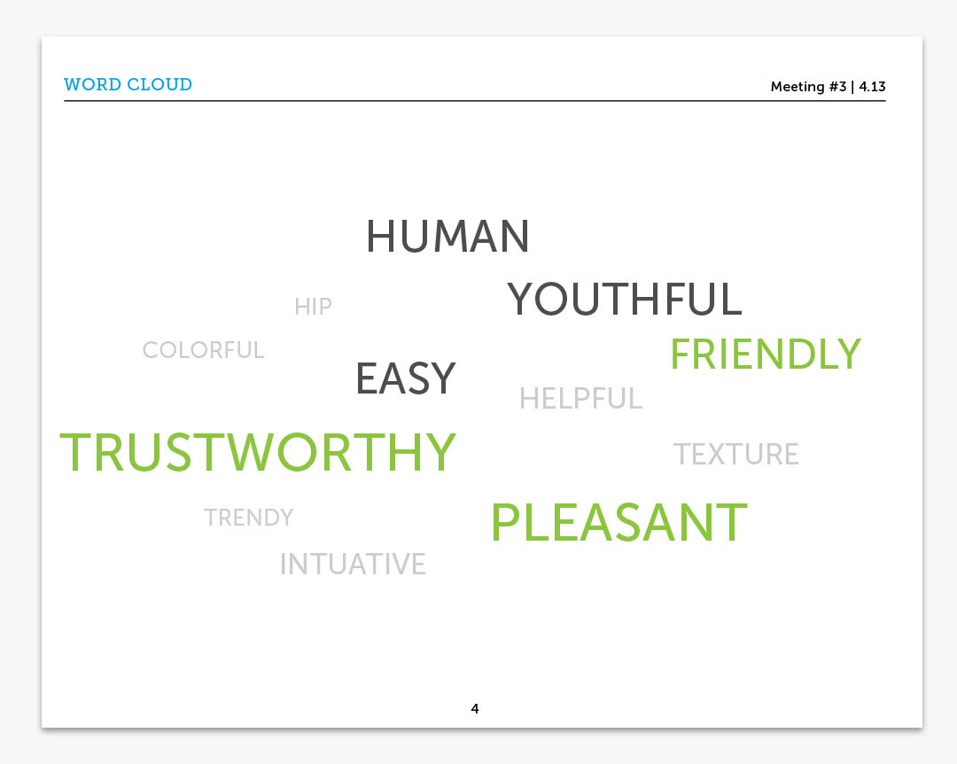
Facilitating a user focus group session
Based on tools and time, we gathered interested users for an in-person focus group session rather than individual testing sessions. We allowed the 5 people to click through the original prototype, review new design options (as printed visuals, not a prototype) and provide their feedback in a conversational setting.
{image: Outline. 5 people. 1 hr. Test prototype. Provide feedback. Review design options}
Feedback from users
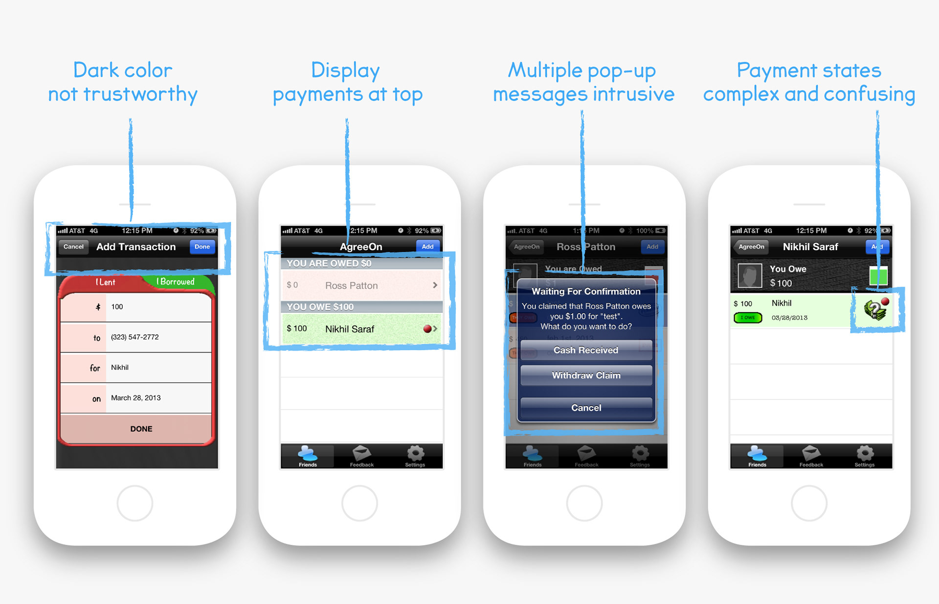
+ The dark color of the app did not feel trustworthy to users. Out of the two new design options, the warm orange resonated most.
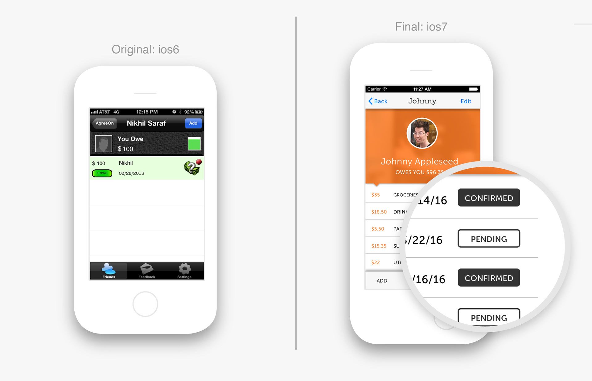
+ On the home screen, users wanted to see "Borrowed" and "Owed" at the top of the screen without having to scroll to see one or the other.
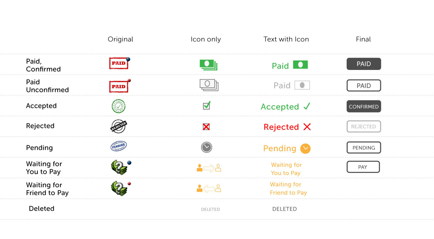
+ The payment states were confusing and complex. Wanted less options and to be more clear
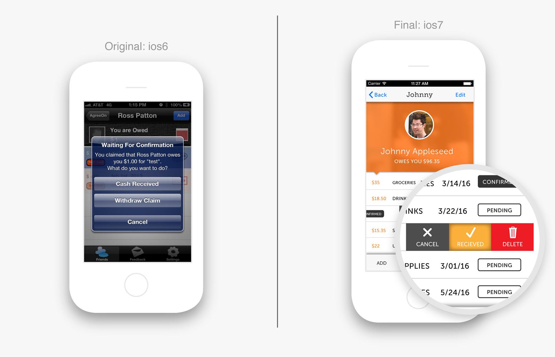
+ Too many pop-up messages. Messaging was helpful, but wanted displayed in less invasive way.
Changes from user feedback
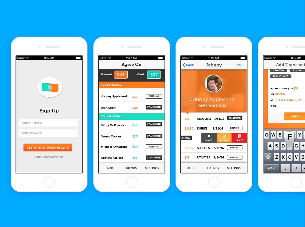
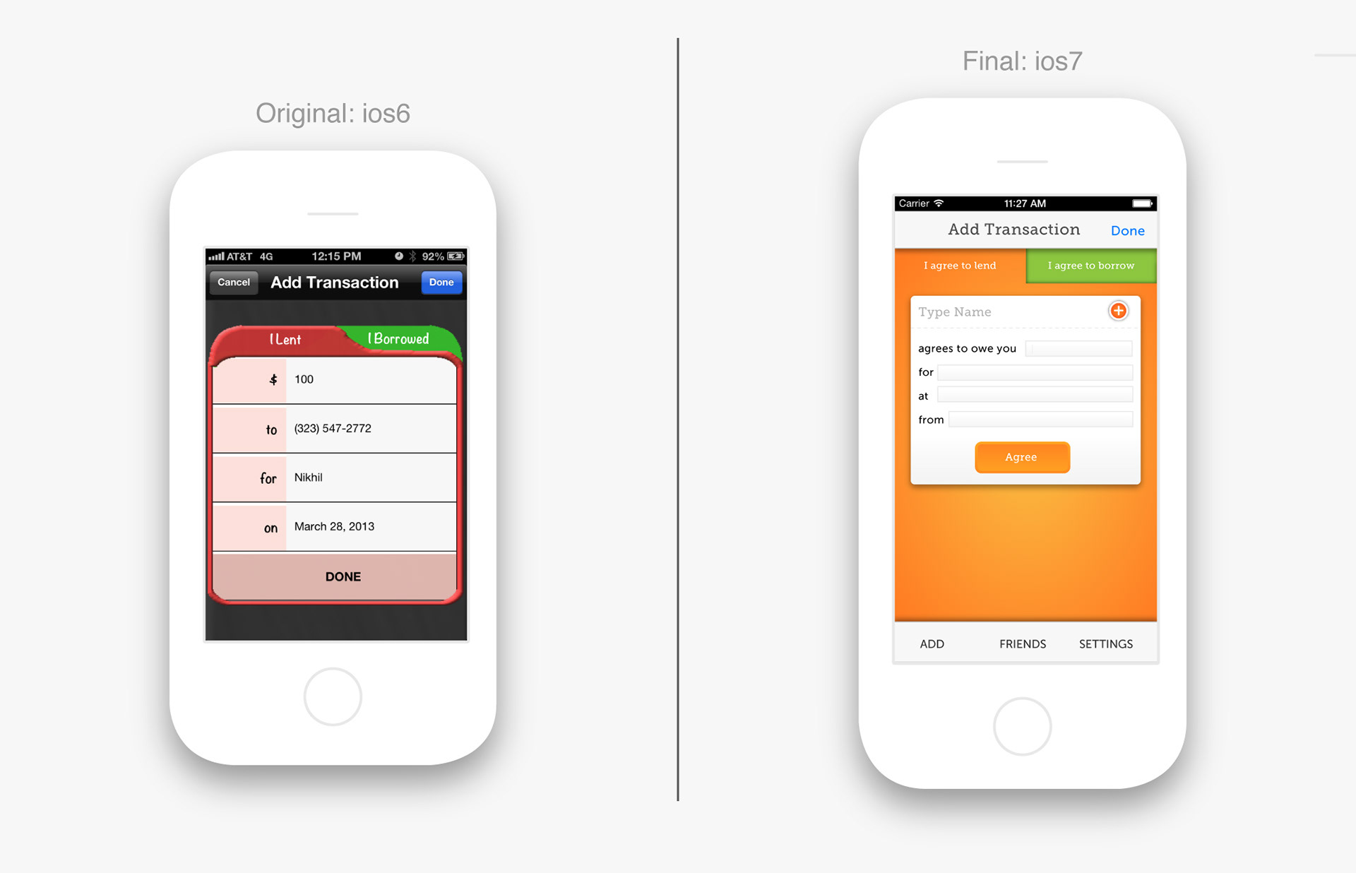
Change: Home Screen
On the home screen, rather than scrolling to see "Borrowed" and "Owed", I created a leaderboard at the top and the ability to easily toggle between the two.
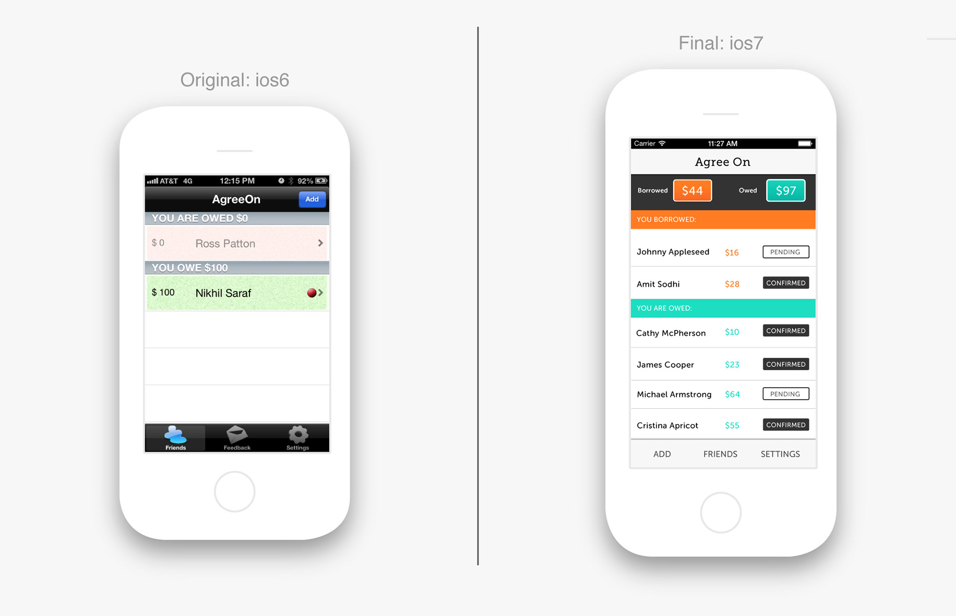
Change: Look & Feel
User picked the warm orange and teal because it felt friendlier and easy to distinguish.
Change: Payment States
We also simplified the seven 'payment states” from icons, which felt complex and confusing, to colorized words
Change: Reducing intrusive pop-ups
We moved the pop-up messaging to make less invasive.
Result
We were able to launch a new MVP for Agree On in the IOS app store. The app began gaining some traction and reviews. I definitely learned a lot through his process. Focus groups are great for extended insight in the early stages of a product. I would have liked to have facilitated a true usability test as well: shorter sessions where the user clicks through the product to reveal what works and where the issues are.